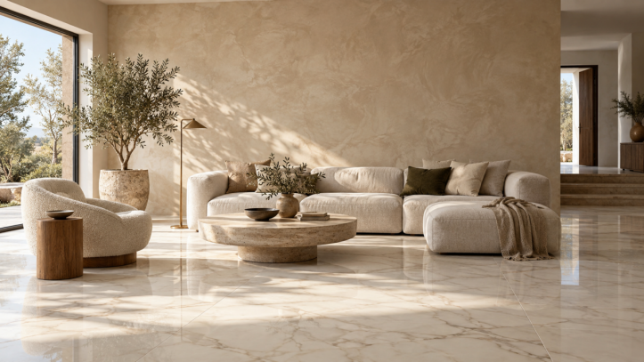
Warm decorative paints soften the movement of large-format marble-look tiles in this contemporary living room.
Plain walls are giving way to surfaces with depth, movement and a handcrafted character. From soft limewash to seamless microcement effects, decorative paints can shape a room without heavy ornament. Paired with ceramic tiles, they create interiors that are expressive, practical and easy to coordinate.
The best decorative paints and tile combinations connect undertone, texture, scale and sheen rather than matching every color. Decorative paints add softness to vertical surfaces, while ceramic or porcelain tiles bring durability to floors, backsplashes and wet zones. The following ideas cover seven popular finishes, reliable tile pairings and practical advice for homes and commercial projects.
Why Decorative Paints Work with Ceramic Tiles
Decorative paints respond to changing light, so even a neutral wall can appear soft in daylight and more dramatic under evening lighting. Ceramic tiles provide a precise counterpoint through controlled formats, joints and surface performance.
This combination also places each material where it works best. Use a suitable decorative wall coating on interior walls and specify ceramic tiles for floors, splash zones and other demanding areas. For a balanced scheme, let one surface carry the stronger pattern while the other supports it with quieter texture.
7 Decorative Paint Finishes for Modern Walls
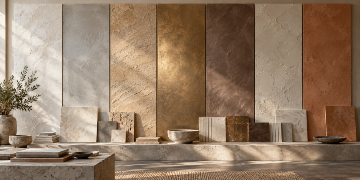
Compare wall and tile samples together under the lighting planned for the finished room.
1 Limewash Decorative Paints
Limewash-inspired decorative paints create cloudy tonal movement and a soft mineral appearance. Beige, chalk, putty and muted olive pair naturally with stone-look and marble-look ceramic tiles. Choose this finish when the tile has visible veining and the wall needs to add depth without competing for attention.
2 Microcement Effect Decorative Wall Coating
A microcement-effect coating creates a continuous cement appearance with fine trowel marks. Cool grey works well with warm wood-look tiles, while greige coordinates with limestone-look porcelain. Use it in modern apartments, cafés and retail spaces, and follow the manufacturer's system in moisture-prone rooms.
3 Sandstone Textured Wall Finish
Sandstone finishes add grain and natural warmth. Sandy beige, ochre and light taupe complement terrazzo, travertine-look tiles and warm neutral porcelain. Because this textured wall finish already has visible texture, select a quieter tile pattern.
4 Metallic Decorative Paints
Bronze, champagne and pewter finishes introduce controlled highlights to reception areas, restaurant walls or residential niches. Pair a softly metallic wall with matte porcelain or restrained marble-look tiles. Avoid combining highly reflective paint with glossy, strongly veined surfaces across an entire room.
5 Velvet Effect Decorative Paints
Velvet effects change gently with the viewing angle and suit bedrooms, lounges and boutique hotels. Muted sage, dusty blue, mushroom and warm grey pair especially well with wood-look ceramic tiles, creating a comfortable atmosphere with a durable floor.
6 Mineral Plaster Effect Decorative Paints
Mineral plaster effects have more movement than standard paint but less grain than sandstone. Warm plaster suits cream or ivory tile; cooler plaster works with charcoal or smoke-grey porcelain. The finish is versatile enough for living rooms, corridors and retail interiors.
7 Clay Plaster Effect Decorative Paints
Terracotta, cinnamon, muted rose and brown clay effects create an earthy mood. They coordinate well with pale terrazzo because the tile chips can repeat the wall color. Keep the palette focused when combining clay effects with handmade-look ceramic tiles.
Decorative Paints with Marble Look Ceramic Tiles
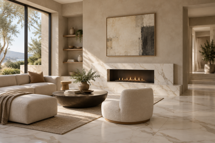
A quiet mineral wall finish allows marble veining to remain the focal point.
Marble-look tiles already contain movement, so pair them with limewash, fine plaster or a low-contrast microcement effect. With white tiles and grey veining, consider warm greige, mushroom or chalky taupe. Cream tiles with gold veining suit sand, oatmeal and pale clay.
Large-format tiles reduce visual interruption and leave more room for a nuanced wall finish. In smaller rooms, use fine texture and gentle contrast to keep the scheme calm.
Decorative Paints with Wood Look Tiles
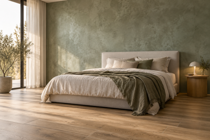
Muted green walls and oak-look ceramic tiles create a restful bedroom palette.
Wood-look tiles bring linear grain and warmth. Honey and golden oak tones coordinate with olive, clay pink and creamy white decorative paints. Pale ash suits sage, blue-grey and cool greige, while dark walnut can be balanced with mushroom or parchment.
Use broad, soft wall movement rather than another strong directional pattern. Matching the grout closely to the tile body also helps the floor read as a continuous surface.
Decorative Paints with Terrazzo Tiles
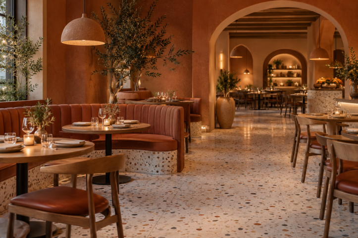
Repeating a secondary terrazzo chip color on the wall creates a deliberate connection.
Terrazzo-look tiles contain several colors, making them flexible partners for decorative paints. Select a quieter chip and repeat that color on the wall. For example, pale terrazzo with rust, beige and charcoal chips can support terracotta, sand or warm grey.
Use a subtle wall texture when the terrazzo pattern is dense. A more restrained tile allows sandstone, clay or limewash effects to show greater movement.
Color Ideas for Homes Hotels and Restaurants
Living rooms benefit from warm neutrals such as oatmeal, greige and muted olive. Bedrooms feel calmer in sage, mushroom, dusty blue and taupe. Hotels can use mineral plaster in corridors and restrained metallic finishes at reception points. Restaurants can support deeper terracotta, burgundy, olive and brown under warm lighting.
Always review samples under the room's actual daylight and artificial lighting. A beige coating may appear pink or grey beside a particular ceramic tile.
Decorative Paints and Tile in Moisture Prone Spaces
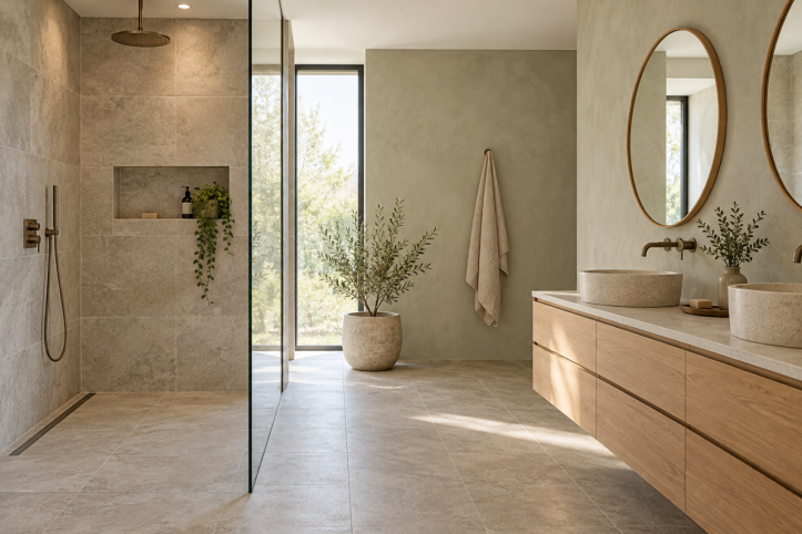
Ceramic tiles protect direct wet zones while decorative paints soften drier bathroom walls.
Decorative paints are not a substitute for waterproofing. Use correctly specified ceramic or porcelain tiles over an appropriate waterproof assembly in showers, around tubs and in direct splash zones. Reserve decorative paints for dry or lower-exposure walls unless the manufacturer approves the complete coating system for the intended wet area.
The substrate must be sound, flat and free from active cracks or damp. Use compatible primers and sealers, confirm cleaning and stain-resistance requirements, and detail junctions neatly where paint meets tile, skirting, counters or sanitary fittings. Prepare a site sample because color, texture and sheen depend on lighting and application technique.
Choosing Decorative Paints and Ceramic Tiles
Place the real wall and tile samples together in the project space. Identify the dominant material, check whether its undertone is warm or cool, and select the second surface in a related undertone. Balance a bold pattern with quieter texture, compare the finishes under planned lighting, and confirm maintenance and installation requirements.
Decorative paints can soften marble-look tiles, warm wood-look flooring and draw color from terrazzo. When scale, undertone and function are considered together, decorative paints and tile create cohesive interiors for living rooms, bedrooms, hotels, restaurants and bathrooms.
Visit China Ceramics City to compare ceramic tile colors, formats and textures for your next residential or commercial project.


